Button
Discover a powerful button component for React & React Native with customizable size, shape, color, and behavior. Perfect for UI design & seamless user interactions. This is an illustration of Button component.variant
action
size
Installation
Run the following command:
npx gluestack-ui add buttonAPI Reference
To use this component in your project, include the following import statement in your file.import {
Button,
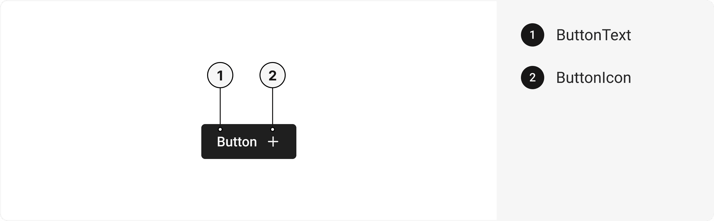
ButtonText,
ButtonSpinner,
ButtonIcon,
ButtonGroup,
} from '@/components/ui/button';

export default () => (
  <ButtonGroup>
    <Button>
      <ButtonText />
      <ButtonSpinner />
      <ButtonIcon />
    </Button>
  </ButtonGroup>
);
Component Props
This section provides a comprehensive reference list for the component props, detailing descriptions, properties, types, and default behavior for easy project integration.Button
Contains all button related layout style props and actions. It inherits all the properties of React Native'sPressable
component.
| Prop | Type | Default | Description |
|---|---|---|---|
isHovered | bool | false | To manually set hover to the button. |
isPressed | bool | false | To manually set pressable state to the button. |
isFocused | bool | false | To manually set focused state to the button. |
isDisabled | bool | false | To manually set disable to the button. |
ButtonText
Contains all text related layout style props and actions. It inherits all the properties of React Native'sText
component.
ButtonGroup
Contains all group related layout style props and actions. It inherits all the properties of React Native'sView
component.
| Prop | Type | Default | Description |
|---|---|---|---|
flexDirection | 'row' | 'column' | 'row-reverse' | 'column-reverse' | 'row' | Set the direction of Button group to vertical or horizontal |
isDisabled | bool | false | When true, this will disable all the buttons in a ButtonGroup. |
isAttached | bool | false | When attached, all buttons will be attached to each other. |
reversed | bool | false | To reverse the order of components. |
space | string | md | It sets the space between different buttons. |
ButtonSpinner
Contains all spinner related layout style props and actions. It inherits all the properties of React Native'sActivityIndicator
component.
ButtonIcon
Contains all Icon related layout style props and actions. It inherits all the properties of React Native'sView
component.
Features
- Keyboard support for actions.
- Support for hover, focus and active states.
- Option to add your styles or use the default styles.
Accessibility
We have outlined the various features that ensure the Button component is accessible to all users, including those with disabilities. These features help ensure that your application is inclusive and meets accessibility standards.Adheres to theWAI-ARIA design pattern
.
Keyboard
- Tab: Moves focus to the next focusable element.
- Shift + Tab: Moves focus to the previous focusable element.
- Enter: Triggers the button's action.
Screen Reader
- VoiceOver: When the button is focused, the screen reader will announce the button's label and its current state.
Focus Management
- TheonFocusandonBlurprops to manage focus states and provide visual cues to users. This is especially important for users who rely on keyboard navigation.
Props
Button component is created using Pressable component from react-native. It extends all the props supported byReact Native Pressable
, utility props
and the props mentioned below.
Button
| Name | Value | Default |
|---|---|---|
action | primary | secondary | positive | negative | default | primary |
variant | link | outline | solid | solid |
size | xs | sm | md | lg | xl | md |
Important Note
Note: These props are exclusively applicable when utilizing the default configuration of gluestack-ui/config. If you are using a custom theme, these props may not be available.
Data Attributes Table
Component receives states as props as boolean values, which are applied asdata-*
attributes. These attributes are then used to style the component via classNames, enabling state-based styling.
| State | Data Attribute | Values |
|---|---|---|
hover | data-hover | true | false |
active | data-active | true | false |
disabled | data-disabled | true | false |
focusVisible | data-focus-visible | true | false |
Examples
The Examples section provides visual representations of the different variants of the component, allowing you to quickly and easily determine which one best fits your needs. Simply copy the code and integrate it into your project.Button with Loading State
A loading button is a type of button component that provides visual feedback to the user during an action that takes some time to complete. It typically displays an animated loading icon or spinner indicating the action is in progress.Icon Button
A button with an icon integrates a visual symbol within the button component, enhancing its appearance and providing a recognizable and intuitive representation of its associated action or functionality.Link Button
A button with a link combines the interactive behavior of a button component with the ability to navigate to a specified URL, providing a clickable element for users to access external resources or internal pages.Button With Icon
The icon component incorporates a button component, combining visual representation with interactive functionality for seamless user interaction.Button with Full Width
The button with full width component utilizes a button component, expanding its width to occupy the entire available space, creating a visually prominent and easily accessible interface element.Edit this page on GitHub