Tooltip
Create an intuitive UI using the gluestack-ui Tooltip component in React & React Native. Add hints & tooltips seamlessly. This is an illustration of Tooltip component.placement
Installation
Run the following command:
npx gluestack-ui@latest add tooltipAPI Reference
To use this component in your project, include the following import statement in your file.import { Tooltip } from '@/components/ui/tooltip';
export default () => (
  <Tooltip>
    <TooltipContent>
      <TooltipText />
    </TooltipContent>
  </Tooltip>
);
Component Props
This section provides a comprehensive reference list for the component props, detailing descriptions, properties, types, and default behavior for easy project integration.Tooltip
It inherits all the properties of React Native'sView
component.
| Prop | Type | Default | Description |
|---|---|---|---|
isOpen | boolean | false | Whether the tooltip is opened. Useful for controlling the open state. |
isDisabled | boolean | false | Whether the tooltip is disabled. |
defaultIsOpen | boolean | false | If true, the popover will be opened by default. |
onOpen | () => void | true | This function will be invoked when the tooltip is opened. |
onClose | () => void | - | This function will be invoked when tooltip is closed. It will also be called when the user attempts to close the tooltip via Escape key or backdrop press. |
openDelay | number | 0 | Duration in ms to wait till displaying the tooltip. |
closeDelay | number | 0 | Duration in ms to wait till hiding the tooltip. |
placement | "bottom" | "top" | "right" | "left" | "top left" | "top right" | "bottom left" | "bottom right" | "right top" | "right bottom" | "left top" | "left bottom" | bottom left | Tooltip placement |
children | any | - | The content to display inside the tooltip. |
closeOnClick | boolean | true | Whether tooltip should be closed on Trigger click. |
trigger | () => any | - | Function that returns a React Element. This element will be used as a Trigger for the tooltip. |
offset | number | 10 | Distance between the trigger and the tooltip. |
crossOffset | number | - | The additional offset applied along the cross axis between the element and its trigger element. |
shouldOverlapWithTrigger | boolean | false | Determines whether tooltip content should overlap with the trigger. |
shouldFlip | boolean | true | Whether the element should flip its orientation (e.g. top to bottom or left to right) when there is insufficient room for it to render completely. |
closeOnOverlayClick | boolean | true | Closes tooltip when clicked outside. |
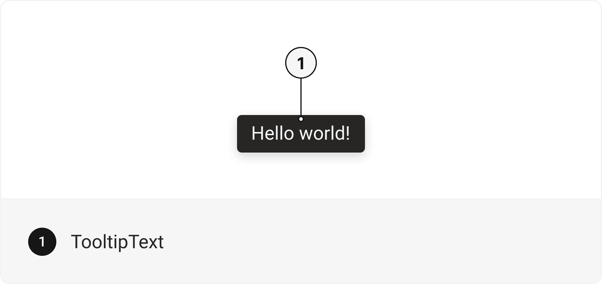
TooltipText
Contains all text related layout style props and actions. It inherits all the properties of React Native's Text component.TooltipContent
Contains all backdrop related layout style props and actions. It inherits all the properties of React Native'sView
component.
Accessibility
We have outlined the various features that ensure the Tooltip component is accessible to all users, including those with disabilities. These features help ensure that your application is inclusive and meets accessibility standards. It adheres to the WAI-ARIA design pattern
.
Examples
Tooltip with Heading
A tooltip component with an avatar is a user interface element that displays a small pop-up box of additional information when the user hovers over or interacts with an avatar or an icon.Tooltip with Icon
A tooltip component with an icon is a user interface element that provides contextual information or explanatory text when the user hovers over or interacts with an icon.Inline Text
Tooltip anchored to inline text elements using long press interactionplacement
Edit this page on GitHub