gluestack-ui is intentionally designed as an unstyled library, providing you with the flexibility to style your components as you prefer.
For users looking for a seamless integration experience, we offer the @gluestack-ui/config package, which comes with pre-configured theme that can easily be integrated with @gluestack-ui/themed for a convenient styling solution.
gluestack-ui simplifies the development process by wrapping your app within the GluestackUIProvider and passing the configuration as a parameter. This instantly unlocks the magic of seamless styling. These components are reusable, consistent, interactive, and accessible on web, iOS, and Android.
Architecture
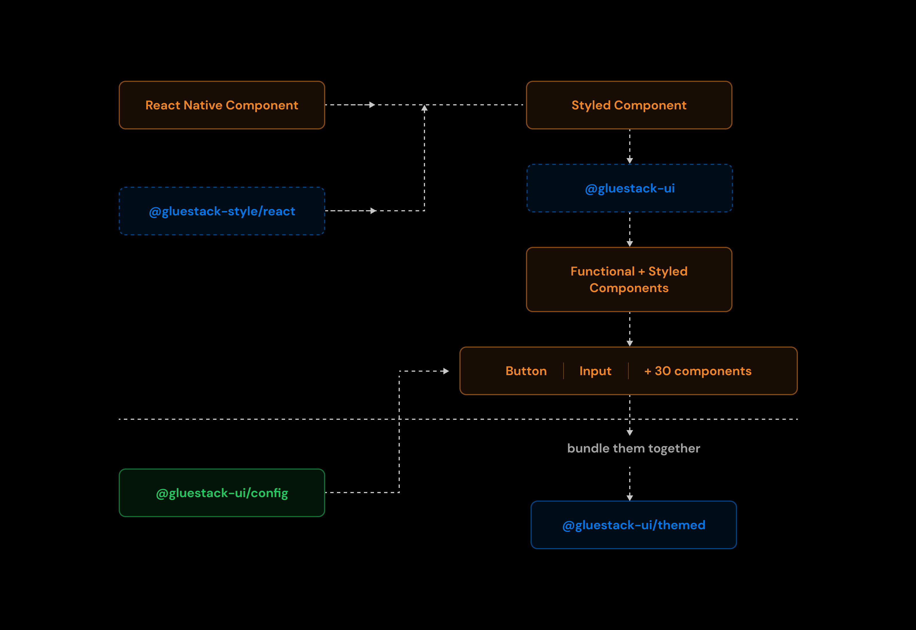
We will try and understand how the components exported from @gluestack-ui/themed are created. Initially, we generate unstyled components using the gluestack-style styling engine. This allows us to customize styles, use theme tokens, provide styling for dark and light modes, and respond to different screen sizes using @gluestack-style/react. The specifics like themes, tokens, breakpoints and component themes are defined in a configuration file.
After that, we enhance the components with accessibility features, interactivity, and more using gluestack-ui. This library provides creator functions that take our components and transform them into fully functional components. Once our components are both user-friendly and interactive, we bundle them together into a new package called @gluestack-ui/themed, which we can then easily use in our project. This package is also themeable, and we can create new themes and use them in our project by passing it to GluestackUIProvider. @gluestack-ui/config provides a default theme config which can be passed to GluestackUIProvider. You can view default theme config here. To see all the components with the default theme, please visit here.
Features
@gluestack-ui/themed uses @gluestack-style/react for styling components, it provides features such as:
- Tokens
- Themes
- Overwriting components base styles
@gluestack-ui/config exports a config file that allows us to manipulate the theme tokens and add new themes. Theme tokens are standardized values that represent various design attributes, such as colors, typography settings, spacing, and more. These tokens serve as a consistent and centralized way to define and manage the visual properties of UI components across your application. Customizing these tokens can also be done, for more information refer to this link.
Component styling is accomplished through @gluestack-style/react. You can customize the styles of each component, and detailed information related to that is available here.
Usage
// import { GluestackUIProvider, Button, ButtonText } from "@gluestack-ui/themed";// import { config } from "@gluestack-ui/config";function App() {return (<GluestackUIProvider config={config}><Button><ButtonText>Hello world</ButtonText></Button></GluestackUIProvider>)}