Oct 12, 2023

gluestack-ui v1.0 is here!
Universal & Accessible UI Components for React Native & Web, Unstyled & Themed!
Push to production faster
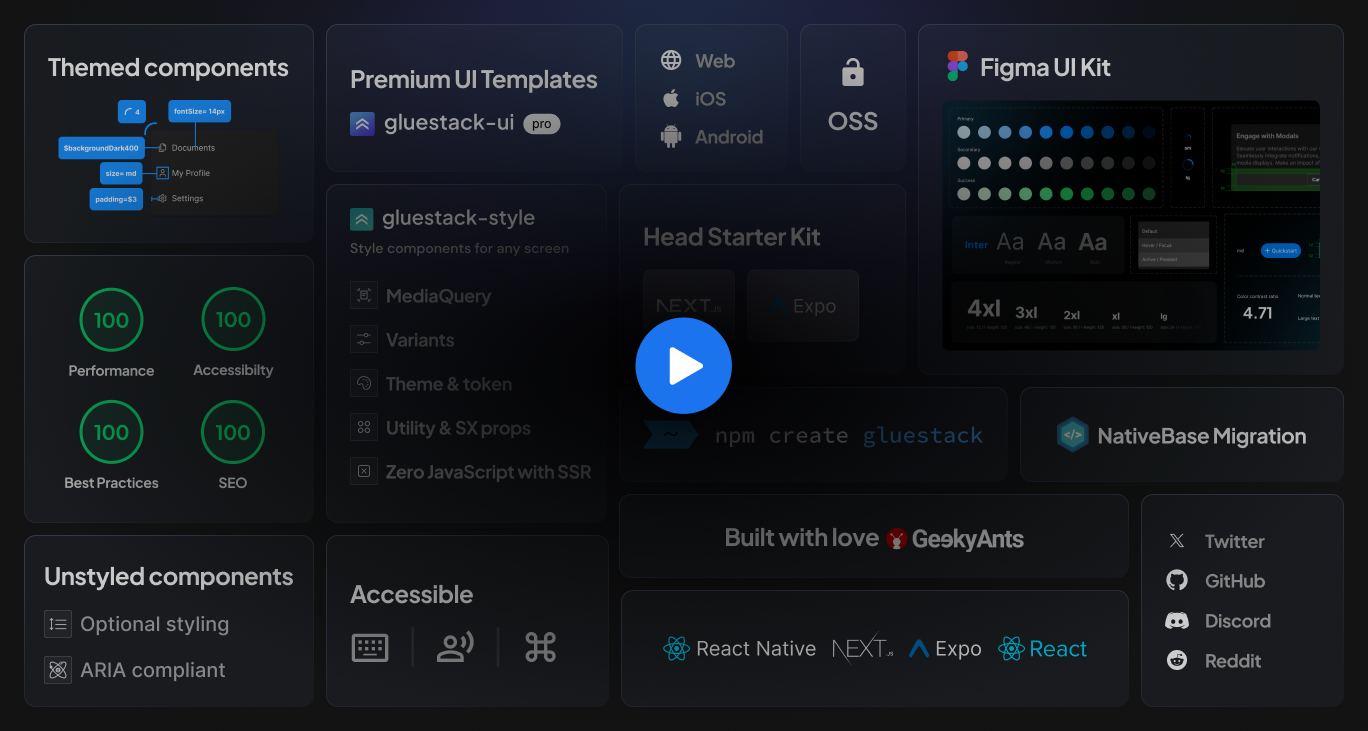
Ready-to-use Themed Components
Pre-designed UI components that are styled according to a specific theme or design language. These components are reusable, consistent, interactive and are accessible on the web, iOS, and Android.


Remodel as you want
Unstyled components to start from scratch
Primitive UI components that can be modified and styled according to your design system.
Job Application Form
Thank you for your interest in working with us. Please send your application by filling this form.
Name
Email
What is your current employement status?
Years of experience
0
20
Portfolio link
Button Label
Button variant
Button action
Input variant
Checkbox Label
Browse Extension
VS Code Extension
No need to write extensive lines of code. Just type the name of the desired component and get the entire length of code written for you. It's that simple!
Component Snippets - Instantly insert component code with shorthand snippets that begin with 'gs-' followed by the component name.
Additional Recipes - Access a variety of predefined code templates beyond basic components.
Automatic Imports - Simplify your workflow with automated import statements for Gluestack.
Dynamic hooks & Variables - Enhance functionality with hooks and variables that adapt to your needs.
In-sync figma components
Figma UI Kit
Automated UI component library within Figma that mirrors our codebase. Any modifications made in the code are instantly reflected and updated within the Figma library, maintaining real-time alignment between design and development.


Get a taste
Head Starter kit
Test drive gluestack-ui with free template screens.
Fully Responsive
Responsive screens that look great at any screen size.
Dark Mode
All the screens have support for a Dark Theme unlike the regular themes.
Production Ready
Build production-ready experiences with no hassle.
Accessible
Updated and tested for keyboard operability and screen reader support.
Style components for any screen
gluestack-style as styling engine
Universal and highly performant styling library, to create beautiful styled-components that lets you focus specifically on styling without the added complexity of a full component library.
Universal
Consistent and reliable styling across all devices.
MediaQuery
Apply different styles at different breakpoints.
Variants
Greater flexibility and reusability of components.
Utility & SX props
Optimal styling options for components.
Theme & token
Easy theme creation and attribute storage.
Zero JavaScript with SSR
Quicker load time with greater accessibility.
Installs in a flash
Easy Onboarding
We have an easy one-line installation and a free starter kit for you to get a taste of the library.
Are you migrating from NativeBase?
Check out our Migration Guide
Write once, run anywhere
Universal to the core
Now create as if web and mobile don't exist. gluestack-ui is universal — eliminating effort duplication and unnecessary overheads. Components are usable across all platforms.

Blazing fast output
Highly Performant
gluestack-ui is built to be highly performant. Benchmarking with other popular libraries shows how well gluestack-ui performs in realtime environments. Expect even faster speed in the upcoming releases!
Simple Themed Component


As of 21 September 2023
Component With Different Variants


As of 21 September 2023
Component With Default Theme And Inline Styles


As of 21 September 2023
Layout Using HStack, VStack,Image And Text


As of 21 September 2023
Too easy to use
Accessibility baked in
gluestack-ui components are designed to be fully operable and navigable, ensuring a smooth and intuitive user experience with the correct keyboard interaction, gestures, screen-readers and the right color contrast!

Choose as you go
Treeshake out the unused ones
The themed library is treeshakeable that means you only add what your app needs.
Label
Helper Text
6/12
Label
Helper Text
6/12
Label
Helper Text
6/12
Info
Success
Error
Warning
Default
S
Ronald Richards
Nursing Assistant
Your order has been received and is being processed.
Your changes have been saved successfully.
There was an error processing your request.
Your account subscription will expire in 5 days.
Please review and accept our updated terms and conditions.
Make it your own
Create Design Systems
Craft a unique design ecosystem with a collection of components that align perfectly with your creative vision.


See what we have for you
Something for everyone
Everything developers and designers need to build awesome products fast. Ideal for building design systems that guarantee better collaboration and increased productivity across teams.
Developers: UI Component Library
Highly performant package that reduces runtime with a babel-plugin.
More options with themed as well as primitive components.
Open-source libraries for inclusive development.
gluestack-style
Universal and Performant Styling Library.
VS Code Extension
Utilize our extension for quicker development with gluestack snippets, simplifying commonly used gluestack-ui components.

Businesses: Faster Development & Better ROI
Tailored enterprise solution with a powerful design system creator tool.
Faster-than-industry app development timelines.
Expert support and maintenance from the creators of the products.
47%
Faster Development Cycle
32%
Higher Growth Revenue
60%
Reduction in Design Debt
We are getting better everyday
Our journey
The road to v1.0 has been exciting; we have much more coming up! Stay tuned for a sneak peek into the future of gluestack-ui.

Be a part of this journey
Join our community
We are constantly pushing new upgrades for gluestack-ui and welcome any query from our community. Join our socials to stay updated and receive support related to gluestack-ui.
Twitter
For announcements, blog posts, and general Stitches tips.
GitHub
To file issues, request features, and contribute, check out our GitHub.
Discord
To get involved in the community, ask questions, and share tips.
LinkedIn
Join our LinkedIn community to collaborate on enterprise-level projects.
Stackoverflow
Receive firsthand assistance from our community of developers.
Made with gluestack-ui