Drawer
Implement a responsive Drawer component in React & React Native for navigation and content display. Learn how to install, customize, and integrate it into your project. This is an illustration of Drawer component.size
anchor
Installation
Run the following command:
npx gluestack-ui@latest add drawerAPI Reference
To use this component in your project, include the following import statement in your file.import {
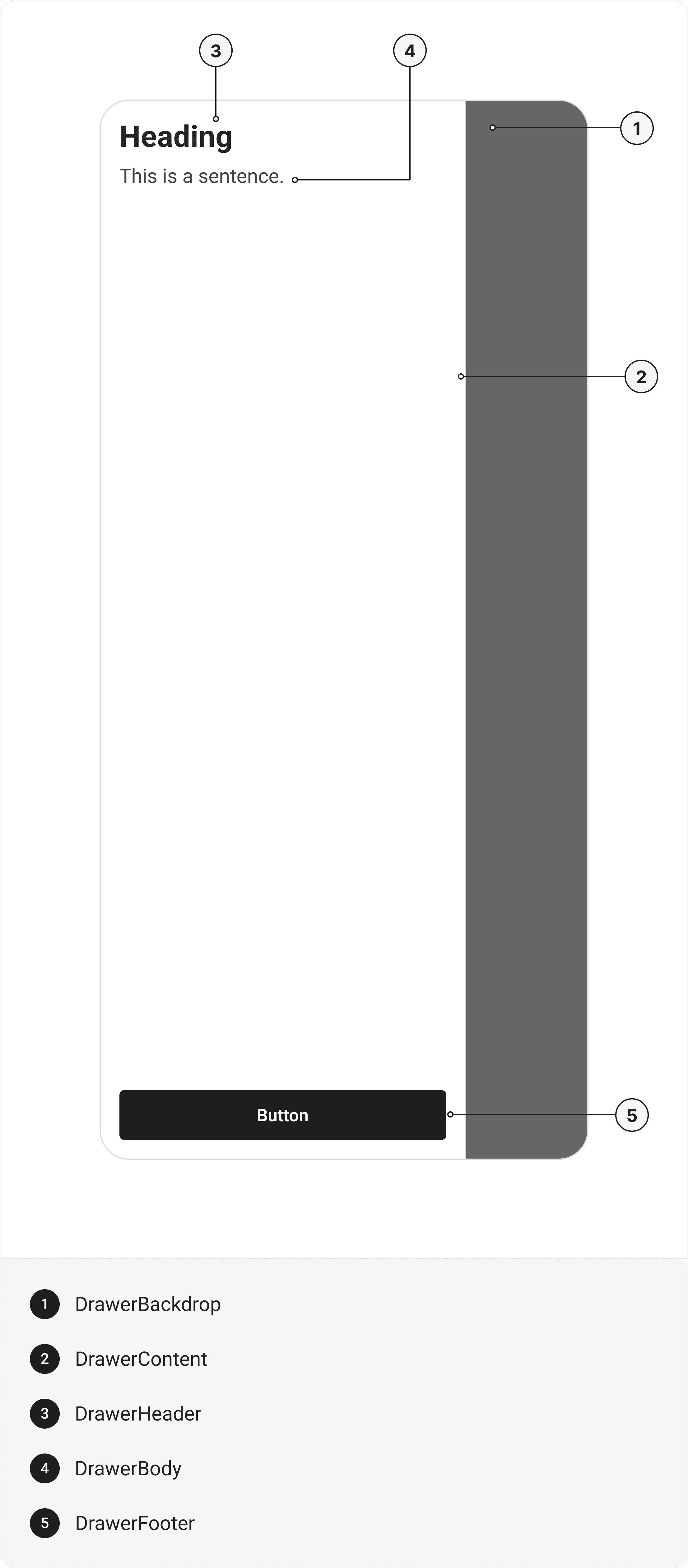
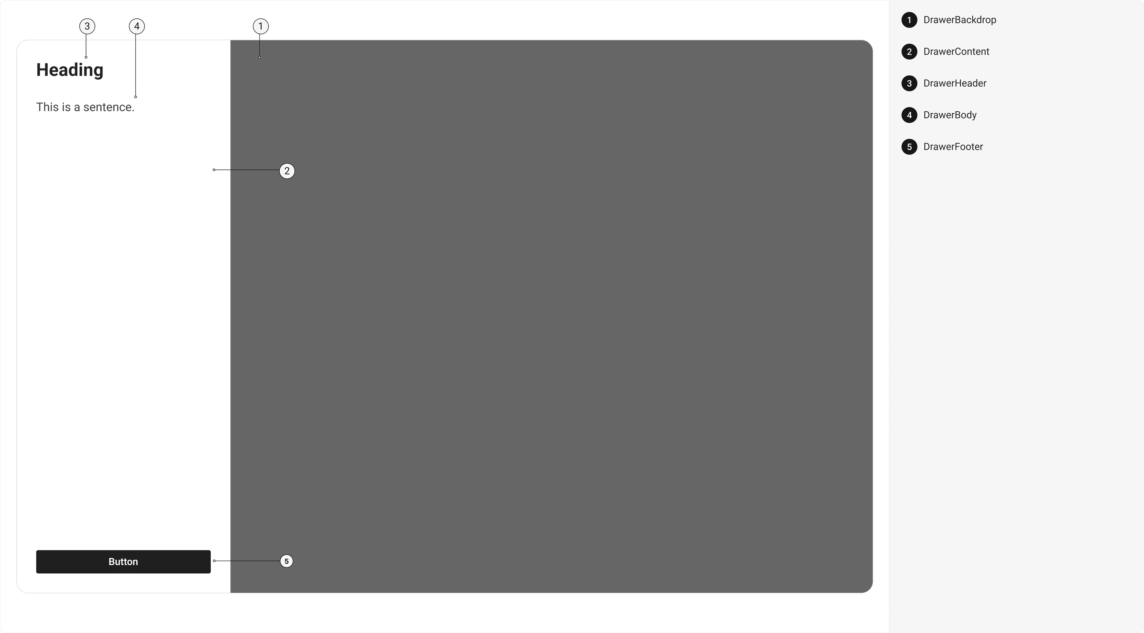
Drawer,
DrawerBackdrop,
DrawerContent,
DrawerHeader,
DrawerCloseButton,
DrawerBody,
DrawerFooter,
} from '@/components/ui/drawer';
export default () => (
  <Drawer>
    <DrawerBackdrop />
    <DrawerContent>
      <DrawerHeader>
        <DrawerCloseButton></DrawerCloseButton>
      </DrawerHeader>
      <DrawerBody />
      <DrawerFooter />
    </DrawerContent>
  </Drawer>
);
Component Props
This section provides a comprehensive reference list for the component props, detailing descriptions, properties, types, and default behavior for easy project integration.Drawer
Contains all View related layout style props and actions. It inherits all the properties of React Native'sView
component.
| Prop | Type | Default | Description |
|---|---|---|---|
isOpen | boolean | - | If true, the drawer will open. Useful for controllable state behavior. |
onClose | () => any | - | Callback invoked when the drawer is closed. |
defaultIsOpen | boolean | - | Specifies the default open state of the Drawer |
initialFocusRef | React.RefObject<any> | - | The ref of element to receive focus when the drawer opens. |
finalFocusRef | React.RefObject<any> | - | The ref of element to receive focus when the drawer closes |
avoidKeyboard | boolean | - | If true, the Drawer will avoid the keyboard. |
closeOnOverlayClick | boolean | - | If true, the Drawer will close when the overlay is clicked. |
isKeyboardDismissable | boolean | - | If true, the keyboard can dismiss the Drawer |
children | any | - | The content to display inside the Drawer |
DrawerBackdrop
It is React Native'sPressable
component, created using react-native-reanimated's
Animated.createAnimatedComponent
function to add animation to the component. You can use any declarative animation library you prefer.
DrawerContent
It isreact-native-reanimated's
Animated.View
component. You can use any declarative animation library you prefer.
| Prop | Type | Default | Description |
|---|---|---|---|
focusable | boolean | false | If true, Drawer Content will be focusable. |
DrawerHeader
It inherits all the properties of React Native'sView
component.
DrawerCloseButton
It inherits all the properties of React Native'sView
component.
DrawerBody
It inherits all the properties of React Native'sView
component
DrawerFooter
It inherits all the properties of React Native'sView
component.
Props
Modal component is created using View component from react-native. It extends all the props supported byReact Native View
, utility props
and the props mentioned below.
Modal
| Name | Value | Default |
|---|---|---|
size | xs | sm | md | lg | full | sm |
anchor | left | right | top | bottom | left |
Examples
The Examples section provides visual representations of the different variants of the component, allowing you to quickly and easily determine which one best fits your needs. Simply copy the code and integrate it into your project.Filter
Sidebar Menu
Edit this page on GitHub