Performance Benchmarks
gluestack-ui
harnesses the power of NativeWind
, a universal and highly performant styling library, to style the components.
React Native
We performed thebenchmarks
with React Native
, gluestack-ui v1
and gluestack-ui v2
.
In each case we have rendered 1000 components with styling of each library. Results are average of 5 mounts.
Important Note
All the benchmarks were measured in production environment on iPhone 15.
Simple Component
The time it takes to render a simple themed component. We've developed a Box component using View with some default styles.React Native
68 ms
gluestack-ui v1
132 ms
gluestack-ui v2
99 ms
Component with variants
The time needed to render a component with different variations. We've developed a Box component using View with default styles and multiple variants.React Native
73 ms
gluestack-ui v1
146 ms
gluestack-ui v2
144 ms
Important Note
Styled Components doesn't have built-in support for variants. We've incorporated prop-based variants into Styled Components.
Component with default theme and inline styles
A component with default themes, variations, inline styles, and state styles. We've designed a Button component using Pressable with default style, variations, state style, and inline styles.gluestack-ui v1
360 ms
gluestack-ui v2
241 ms
Important Note
React Native doesn't provide out of the box support for state styling.
Layout using HStack, VStack, Image and Text
Creating a layout with HStack, VStack, Image, and Text to display a list of 28 items. We've utilized components from the following libraries for this purpose.React Native
58 ms
gluestack-ui v1
89 ms
gluestack-ui v2
76 ms
Important Note
Note: This test was taken from Tamagui.
Web
We are working on dedicated benchmarks for the web. Stay tuned for more updates! In the meantime, we have built the landing page for v2 using gluestack-ui v2. You can check out the lighthouse score below: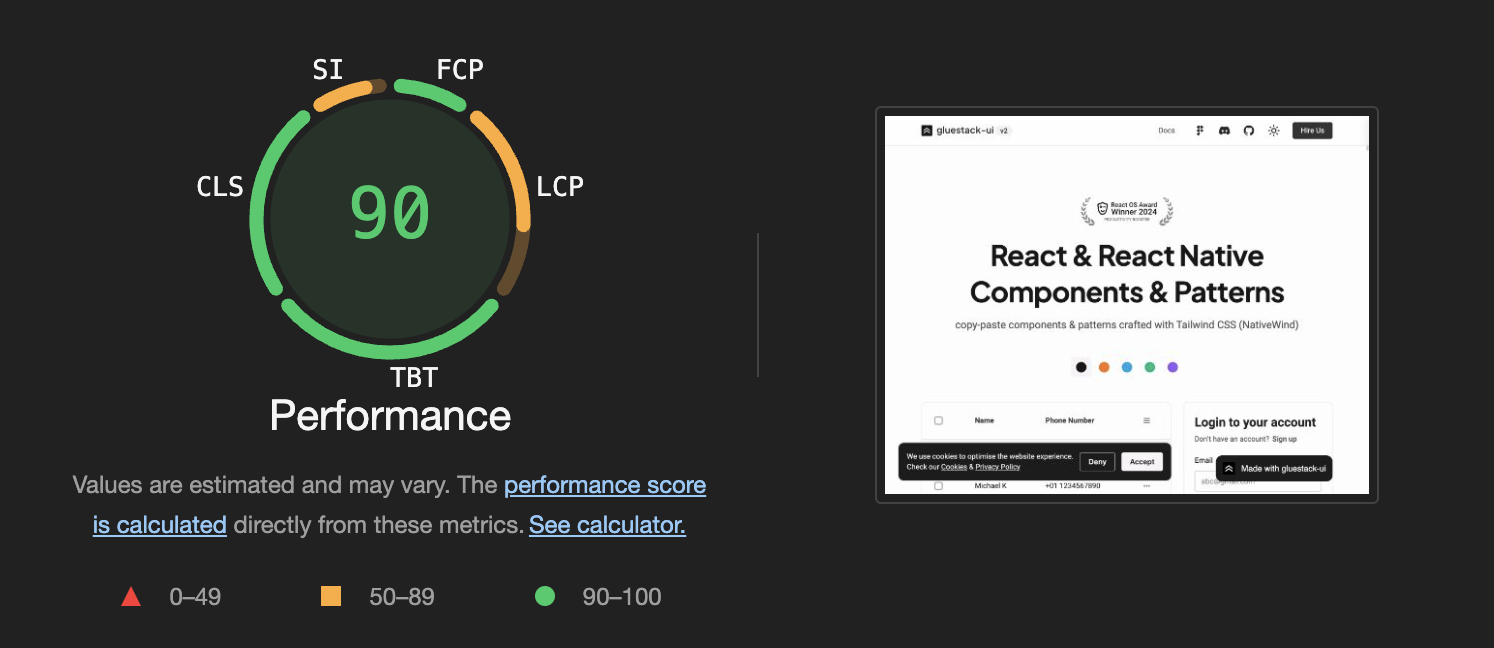
Edit this page on GitHub