Modal
Create smooth and accessible modals in React & React Native. Implement React modal components for alerts, forms, and notifications with ease. Optimize modal component for better user engagement. This is an illustration of Modal component.size
Installation
Run the following command:
npx gluestack-ui@latest add modalAPI Reference
To use this component in your project, include the following import statement in your file.import {
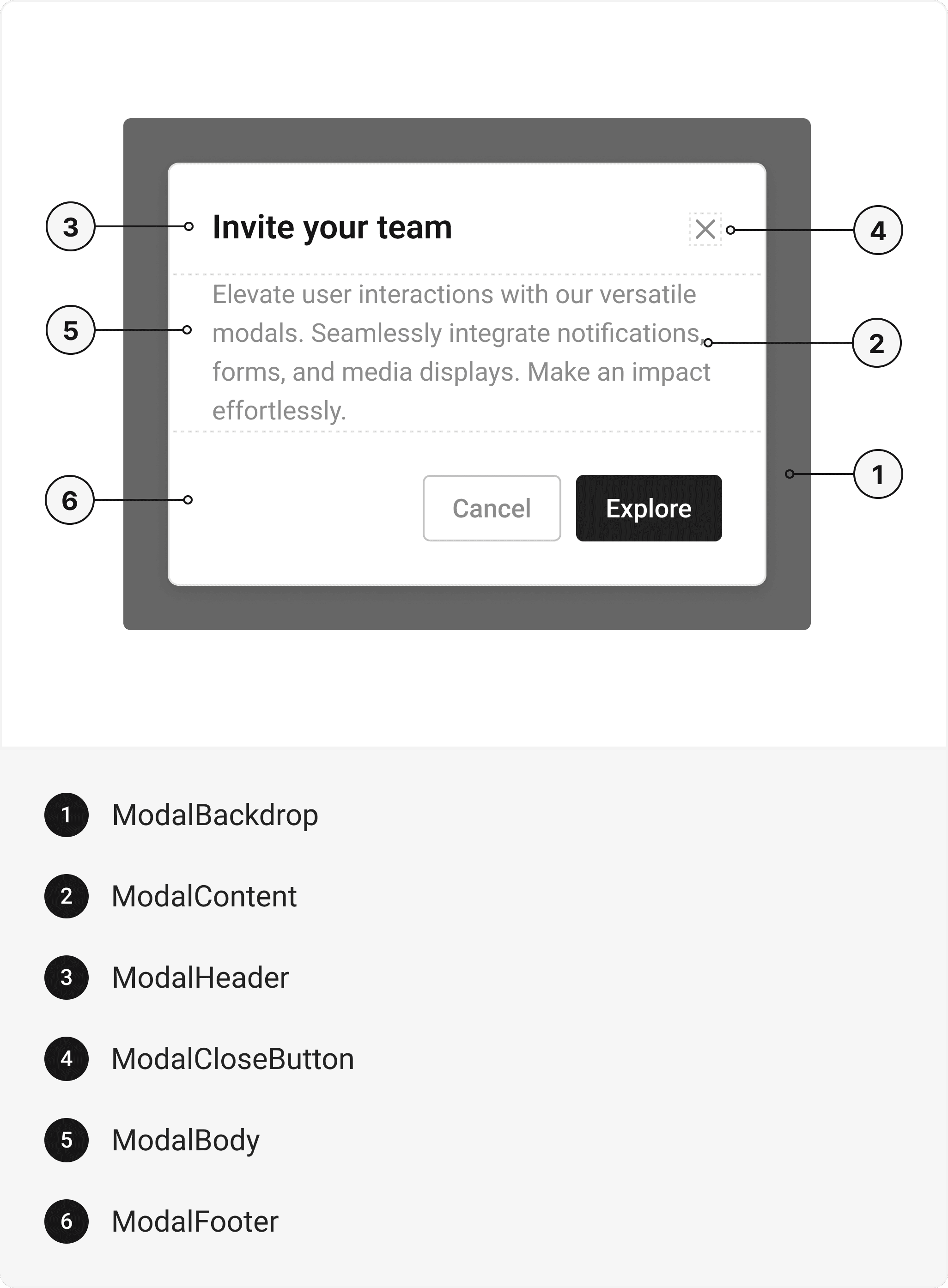
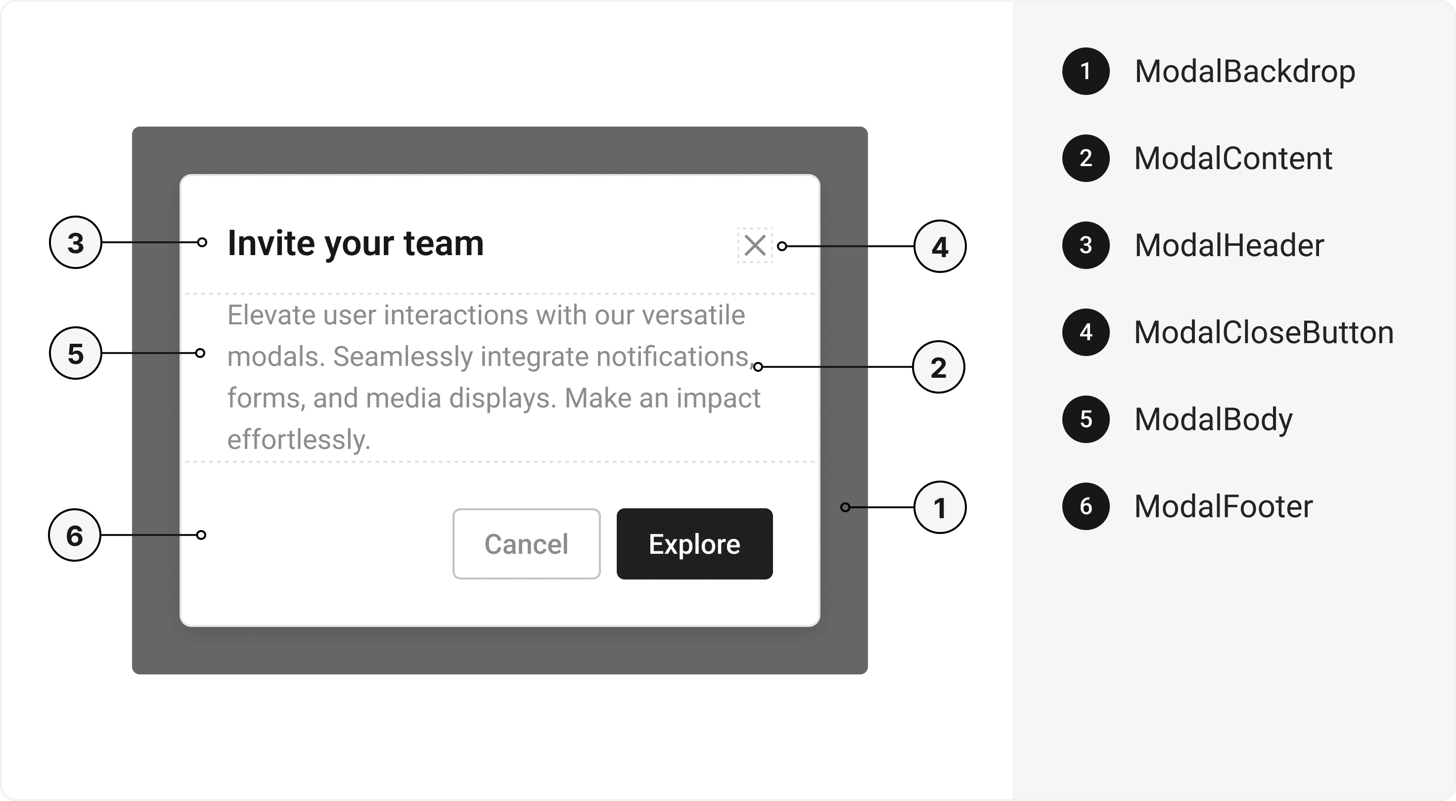
Modal,
ModalBackdrop,
ModalContent,
ModalHeader,
ModalCloseButton,
ModalBody,
ModalFooter,
} from '@/components/ui/modal';
export default () => (
  <Modal>
    <ModalBackdrop />
    <ModalContent>
      <ModalHeader>
        <ModalCloseButton></ModalCloseButton>
      </ModalHeader>
      <ModalBody />
      <ModalFooter />
    </ModalContent>
  </Modal>
);
Component Props
This section provides a comprehensive reference list for the component props, detailing descriptions, properties, types, and default behavior for easy project integration.Modal
Contains all View related layout style props and actions. It inherits all the properties of React Native'sView
component.
| Prop | Type | Default | Description |
|---|---|---|---|
isOpen | boolean | - | If true, the modal will open. Useful for controllable state behavior |
onClose | () => any | - | Callback invoked when the modal is closed |
useRNModal | boolean | false | If true, renders react-native native modal |
defaultIsOpen | boolean | - | Specifies the default open state of the Modal |
initialFocusRef | React.RefObject<any> | - | The ref of element to receive focus when the modal opens |
finalFocusRef | React.RefObject<any> | - | The ref of element to receive focus when the modal closes |
avoidKeyboard | boolean | - | If true, the Modal will avoid the keyboard |
closeOnOverlayClick | boolean | - | If true, the Modal will close when the overlay is clicked |
isKeyboardDismissable | boolean | - | If true, the keyboard can dismiss the Modal |
children | any | - | The content to display inside the Modal |
ModalBackdrop
It is React Native'sPressable
component, created using react-native-reanimated's
Animated.createAnimatedComponent
function to add animation to the component.
ModalContent
It isreact-native-reanimated's
Animated.View
component.
| Prop | Type | Default | Description |
|---|---|---|---|
focusable | boolean | false | If true, Modal Content will be focusable |
ModalHeader
It inherits all the properties of React Native'sView
component.
ModalCloseButton
It inherits all the properties of React Native'sView
component.
ModalBody
It inherits all the properties of React Native'sView
component.
ModalFooter
It inherits all the properties of React Native'sView
component.
Accessibility
We have outlined the various features that ensure the Modal component is accessible to all users, including those with disabilities. These features help ensure that your application is inclusive and meets accessibility standards. It uses React Native ARIA@react-native-aria/focus
which follows the Dialog Modal WAI-ARIA design pattern
.
Props
Modal component is created using View component from react-native. It extends all the props supported byReact Native View
, utility props
and the props mentioned below.
Modal
| Name | Value | Default |
|---|---|---|
size | xs | sm | md | lg | full | md |
Examples
The Examples section provides visual representations of the different variants of the component, allowing you to quickly and easily determine which one best fits your needs. Simply copy the code and integrate it into your project.Multiple Modals
A user interface featuring multiple modal components that allow for layered interaction and context-specific information display.Onboarding Message
Delete Post
Invite Friends to Project
Edit this page on GitHub