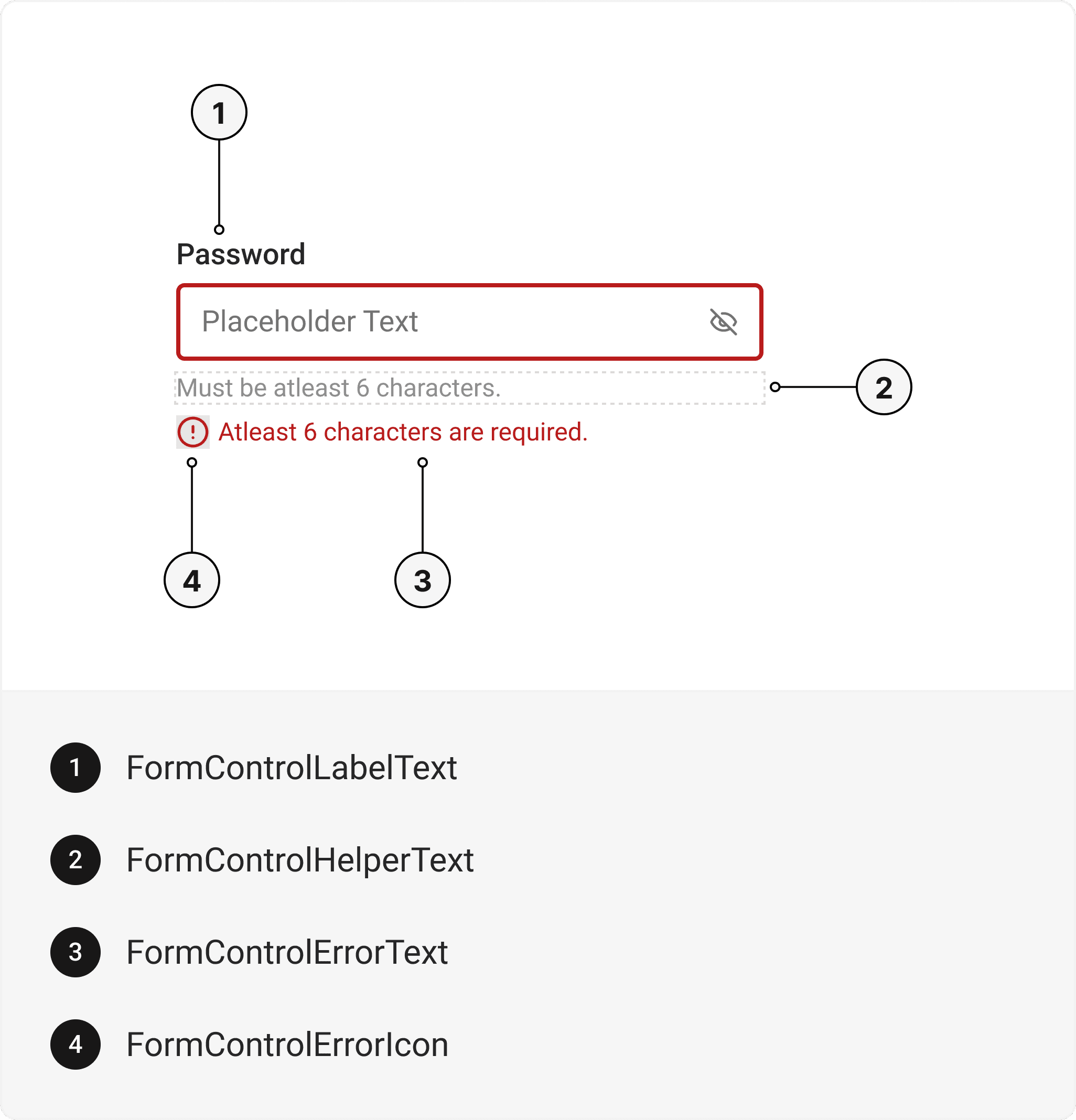
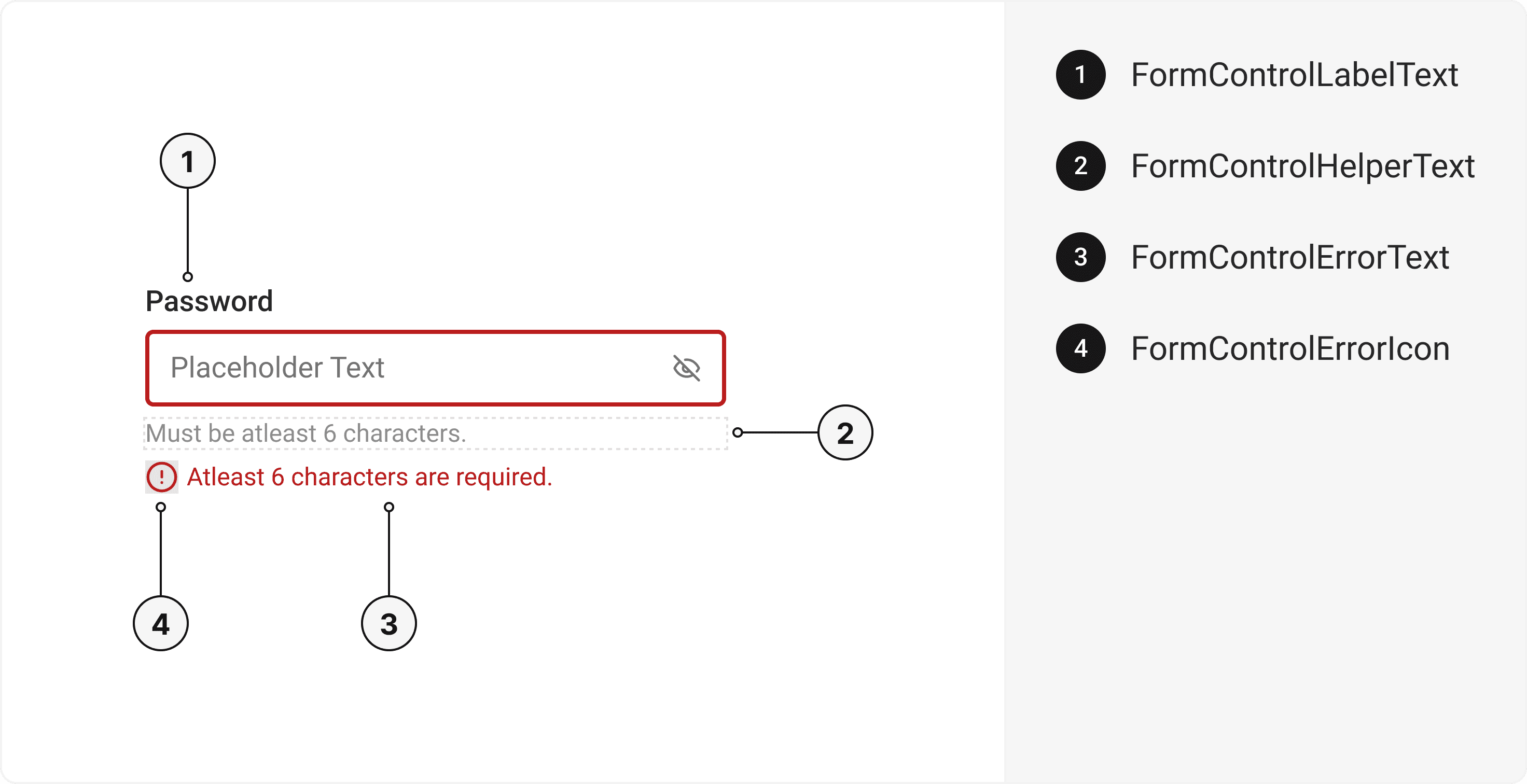
FormControl

Provide context to form elements, such as invalid, disabled, or required states.
Installation
API Reference
Important Note
This is the documentation for gluestack-ui v2 (beta). For @gluestack-ui/themed (stable) documentation, refer to gluestack-ui v1.
This is an illustration of FormControl component.
<Box className="h-32 w-72">
<FormControl {...props}>
<FormControlLabel className="mb-1">
<FormControlLabelText>Password</FormControlLabelText>
</FormControlLabel>
<Input>
<InputField type="password" defaultValue="12345" placeholder="password" />
</Input>
<FormControlHelper>
<FormControlHelperText>
Must be at least 6 characters.
</FormControlHelperText>
</FormControlHelper>
<FormControlError>
<FormControlErrorIcon size={10} as={AlertCircleIcon} />
<FormControlErrorText>
At least 6 characters are required.
</FormControlErrorText>
</FormControlError>
</FormControl>
</Box>

Form Control with Radio

The Radio Component can be incorporated within the FormControl.
<FormControl>
<FormControlLabel>
<FormControlLabelText>Favourite fruit</FormControlLabelText>
</FormControlLabel>
<RadioGroup className="my-2">
<VStack space="sm">
<Radio size="sm" value="Mango">
<RadioIndicator>
<RadioIcon>
<CircleIcon />
</RadioIcon>
</RadioIndicator>
<RadioLabel>Mango</RadioLabel>
</Radio>
<Radio size="sm" value="Apple">
<RadioIndicator>
<RadioIcon>
<CircleIcon />
</RadioIcon>
</RadioIndicator>
<RadioLabel>Apple</RadioLabel>
</Radio>
<Radio size="sm" value="Orange">
<RadioIndicator>
<RadioIcon>
<CircleIcon />
</RadioIcon>
</RadioIndicator>
<RadioLabel>Orange</RadioLabel>
</Radio>
</VStack>
</RadioGroup>
<FormControlHelper>
<FormControlHelperText>
Choose the fruit you like the most
</FormControlHelperText>
</FormControlHelper>
</FormControl>

Installation

Run the following command:

npx gluestack-ui add form-control

API Reference

To use this component in your project, include the following import statement in your file.
import { FormControl } from "@/components/ui/form-control"
export default () => (
<FormControl>
<FormControlLabel>
<FormControlLabelText />
</FormControlLabel>
<FormControlHelper>
<FormControlHelperText />
</FormControlHelper>
<FormControlError>
<FormControlErrorIcon />
<FormControlErrorText />
</FormControlError>
</FormControl>
)

Component Props

This section provides a comprehensive reference list for the component props, detailing descriptions, properties, types, and default behavior for easy project integration.

FormControl

It inherits all the properties of React Native's View component.
Prop
Type
Default
Description
isInvalid
bool
false
When true, invalid state.
isRequired
bool
false
If true, astrick gets activated.
isDisabled
bool
false
Disabled state true.
isReadOnly
bool
false
To manually set read-only state.
isDisabled
bool
false
To manually set disable to the FormControl.

FormControlLabel

It inherits all the properties of React Native's View component.

FormControlLabelText

It inherits all the properties of React Native's Text component.

FormControlHelper

It inherits all the properties of React Native's View component.

FormControlHelperText

It inherits all the properties of React Native's Text component.

FormControlError

It inherits all the properties of React Native's View component.

FormControlErrorIcon

It inherits all the properties of gluestack Style's AsForwarder component.

FormControlErrorText

It inherits all the properties of React Native's Text component.

Features

  • Keyboard support for actions.
  • Support for hover, focus and active states.
  • Option to add your styles or use the default styles.

Props

FormControl component is created using View component from react-native. It extends all the props supported by React Native View.

Examples

The Examples section provides visual representations of the different variants of the component, allowing you to quickly and easily determine which one best fits your needs. Simply copy the code and integrate it into your project.

Form Control with Input

The Input Component can be incorporated within the FormControl.
size
isDisabled
isInvalid
isReadOnly
isRequired
<Box className="h-32 w-72">
<FormControl
size="md"
isDisabled={false}
isInvalid={false}
isReadOnly={false}
isRequired={false}
>
<FormControlLabel className="mb-1">
<FormControlLabelText>Password</FormControlLabelText>
</FormControlLabel>
<Input>
<InputField type="password" defaultValue="12345" placeholder="password" />
</Input>
<FormControlHelper>
<FormControlHelperText>
Must be at least 6 characters.
</FormControlHelperText>
</FormControlHelper>
<FormControlError>
<FormControlErrorIcon size={10} as={AlertCircleIcon} />
<FormControlErrorText>
At least 6 characters are required.
</FormControlErrorText>
</FormControlError>
</FormControl>
</Box>

Form Control with Checkbox

The Checkbox Component can be incorporated within the FormControl.
<FormControl>
<FormControlLabel>
<FormControlLabelText>Sign up for newsletters</FormControlLabelText>
</FormControlLabel>
<CheckboxGroup className="my-2">
<VStack space="sm">
<Checkbox size="sm" value="Mango">
<CheckboxIndicator className="mr-2">
<CheckboxIcon>
<CheckIcon />
</CheckboxIcon>
</CheckboxIndicator>
<CheckboxLabel>Daily Bits</CheckboxLabel>
</Checkbox>
<Checkbox size="sm" value="Apple">
<CheckboxIndicator className="mr-2">
<CheckboxIcon>
<CheckIcon />
</CheckboxIcon>
</CheckboxIndicator>
<CheckboxLabel>Event Updates</CheckboxLabel>
</Checkbox>
<Checkbox size="sm" value="Orange">
<CheckboxIndicator className="mr-2">
<CheckboxIcon>
<CheckIcon />
</CheckboxIcon>
</CheckboxIndicator>
<CheckboxLabel>Sponsorship</CheckboxLabel>
</Checkbox>
</VStack>
</CheckboxGroup>
<FormControlHelper>
<FormControlHelperText>
Subscribe to newsletters for updates
</FormControlHelperText>
</FormControlHelper>
</FormControl>

Form Control with Textarea

The Textarea Component can be incorporated within the FormControl.
<FormControl>
<FormControlLabel>
<FormControlLabelText>Comment</FormControlLabelText>
</FormControlLabel>
<Textarea>
<TextareaInput />
</Textarea>
<FormControlHelper>
<FormControlHelperText>Type your comment above</FormControlHelperText>
</FormControlHelper>
</FormControl>

Form Control with Error

Error messages can be displayed using FormControl.
<FormControl isInvalid>
<FormControlLabel>
<FormControlLabelText>
Which time slot works best for you?
</FormControlLabelText>
</FormControlLabel>
<RadioGroup className="my-2">
<VStack space="sm">
<Radio size="sm" value="Mango">
<RadioIndicator>
<RadioIcon as={CircleIcon} />
</RadioIndicator>
<RadioLabel>Monday</RadioLabel>
</Radio>
<Radio size="sm" value="Apple">
<RadioIndicator>
<RadioIcon as={CircleIcon} />
</RadioIndicator>
<RadioLabel>Tuesday</RadioLabel>
</Radio>
<Radio size="sm" value="Orange">
<RadioIndicator>
<RadioIcon as={CircleIcon} />
</RadioIndicator>
<RadioLabel>Wednesday</RadioLabel>
</Radio>
</VStack>
</RadioGroup>
<FormControlError>
<FormControlErrorIcon as={AlertCircleIcon} />
<FormControlErrorText>
Choose one time slot for the meeting
</FormControlErrorText>
</FormControlError>
</FormControl>

Form Control with Form Actions

Form Action Buttons can also be utilized in conjunction with FormControl.
<HStack>
<FormControl>
<Button variant="outline" action="secondary">
<ButtonText>Cancel</ButtonText>
</Button>
</FormControl>
<FormControl>
<Button action="negative" className="ml-4">
<ButtonText className="text-white group-hover/button:text-white group-active/button:text-white">
Delete
</ButtonText>
</Button>
</FormControl>
</HStack>