Radio
Enhance your UI with a React Native radio button. Easily integrate radio buttons component with full accessibility support. This is an illustration of Radio component.isInvalid
isDisabled
Installation
Run the following command:
npx gluestack-ui@latest add radioAPI Reference
To use this component in your project, include the following import statement in your file.import { Radio } from '@/components/ui/radio';
export default () => (
<RadioGroup>
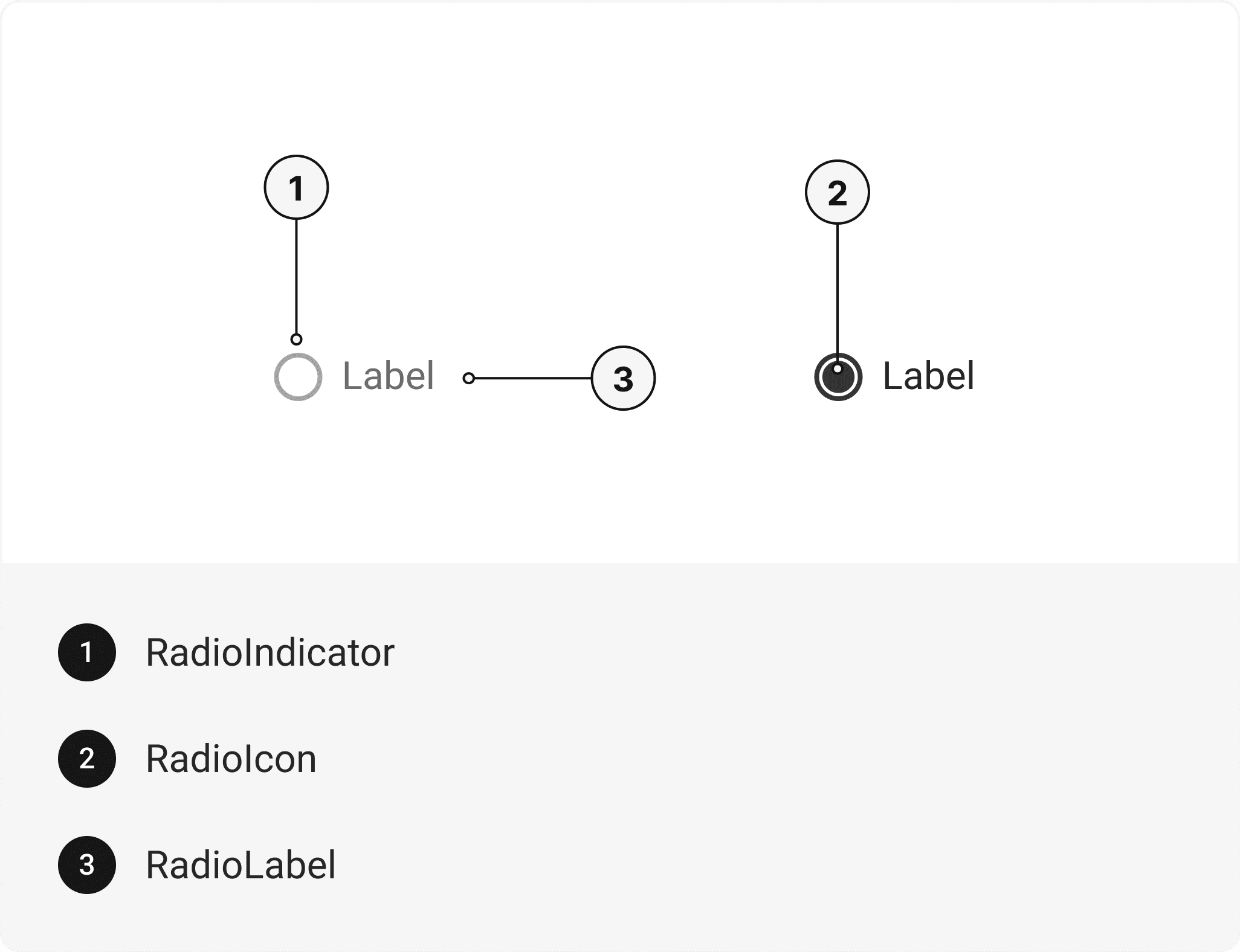
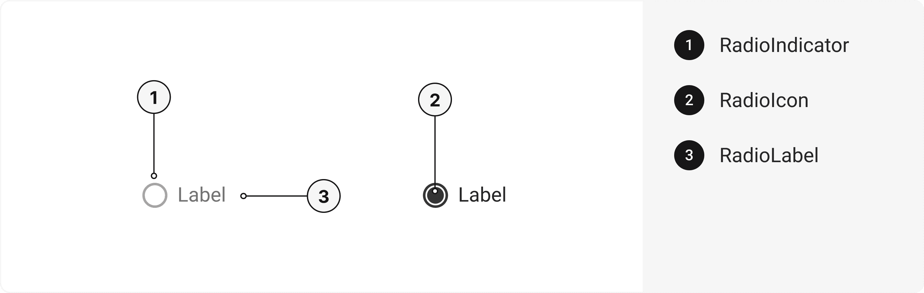
<Radio>
<RadioIndicator>
<RadioIcon />
</RadioIndicator>
<RadioLabel />
</Radio>
</RadioGroup>
);
Component Props
This section provides a comprehensive reference list for the component props, detailing descriptions, properties, types, and default behavior for easy project integration.Radio
Contains all Radio related layout style props and actions. It inherits all the properties of React Native'sView
component.
| Prop | Type | Default | Description |
|---|---|---|---|
value | string | - | The value to be used in the radio input. This is the value that will be returned on form submission. |
onChange | function | - | Function called when the state of the radio changes. |
isDisabled | bool | false | To manually set disable to the radio. |
isInvalid | bool | false | To manually set invalid to the radio. |
isHovered | bool | false | To manually set hover to the radio. |
isFocusVisible | bool | false | To manually set focus visible state to the radio. |
isIndeterminate | bool | false | To manually set indeterminate to the radio. |
RadioIndicator
Contains all Indicator related layout style props and actions. It inherits all the properties of React Native'sView
component.
RadioIcon
Contains all Icon related layout style props and actions. It inherits all the properties of gluestack Style'sAsForwarder
component.
| Prop | Type | Default | Description |
|---|---|---|---|
forceMount | boolean | false | Forces mounting when more control is needed, useful for animations with React libraries. |
RadioLabel
Contains all Label related layout style props and actions. It inherits all the properties of React Native'sText
component.
RadioGroup
Contains all Group related layout style props and actions. It inherits all the properties of React Native'sView
component.
| Prop | Type | Default | Description |
|---|---|---|---|
value | string | - | The value of the radio group. |
onChange | function | - | The callback fired when any children Radio is checked or unchecked. |
isReadOnly | bool | false | To manually set read-only to the radio group. |
Features
- Keyboard support for actions.
- Support for hover, focus and active states.
Accessibility
We have outlined the various features that ensure the Radio component is accessible to all users, including those with disabilities. These features help ensure that your application is inclusive and meets accessibility standards. Adheres to theWAI-ARIA design pattern
.
Keyboard
- Tab: Moves focus to the next focusable element.
- Shift + Tab: Moves focus to the previous focusable element.
- Space: To check or uncheck focused radio.
Screen Reader
- VoiceOver: When the radio is focused, the screen reader will announce it's a radio and it's current state (check or uncheck) and it's label.
Focus Management
- TheonFocusandonBlurprops manage focus states and provide visual cues to users. This is especially important for users who rely on keyboard navigation.
States
- In error state,aria-invalidwill be passed to indicate that the radio input has an error, and providing support for anaria-errormessageto describe the error in more detail.
- In disabled state,aria-hiddenwill be passed to make radio input not focusable.
- In required state,aria-requiredwill be passed to indicate that the radio input is required.
Props
Radio component is created using Pressable component from react-native. It extends all the props supported byReact Native Pressable
.
Data Attributes Table
Component receives states as props as boolean values, which are applied asdata-*
attributes. These attributes are then used to style the component via classNames, enabling state-based styling.
| State | Data Attribute | Values |
|---|---|---|
hover | data-hover | true | false |
active | data-active | true | false |
disabled | data-disabled | true | false |
focusVisible | data-focus-visible | true | false |
invalid | data-invalid | true | false |
Examples
The Examples section provides visual representations of the different variants of the component, allowing you to quickly and easily determine which one best fits your needs. Simply copy the code and integrate it into your project.Multiple Radio
Radio buttons provide a mutually exclusive selection mechanism, allowing users to choose a single option from a set of related choices.Horizontal
Radio buttons can be used horizontally.With help text
Radio buttons can be used with helper text.Form Control
Radio buttons can be used inside FormControl for better control of states and functionality.Label left
Radio buttons can be used horizontallyControlled
The Radio components can be used with a controlled state, enabling precise management of the selected option through external state management.Uncontrolled
The Radio components can be used with either a ref or no state, providing an uncontrolled state where the selected option is managed internally.Radio group
The Radio group component allows users to group radio and display them in a horizontal or vertical row for better visual representation and functionality..Edit this page on GitHub