Slider
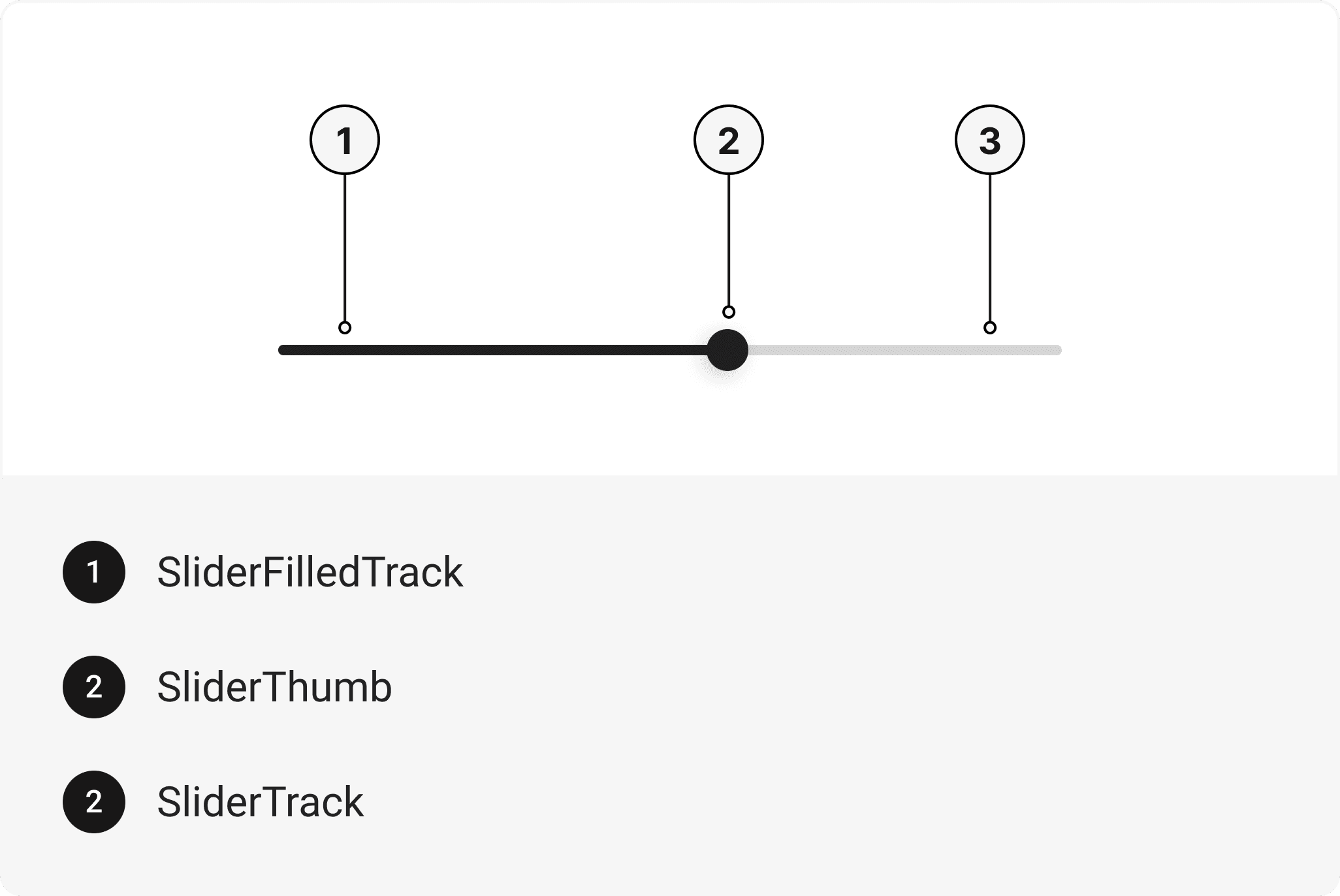
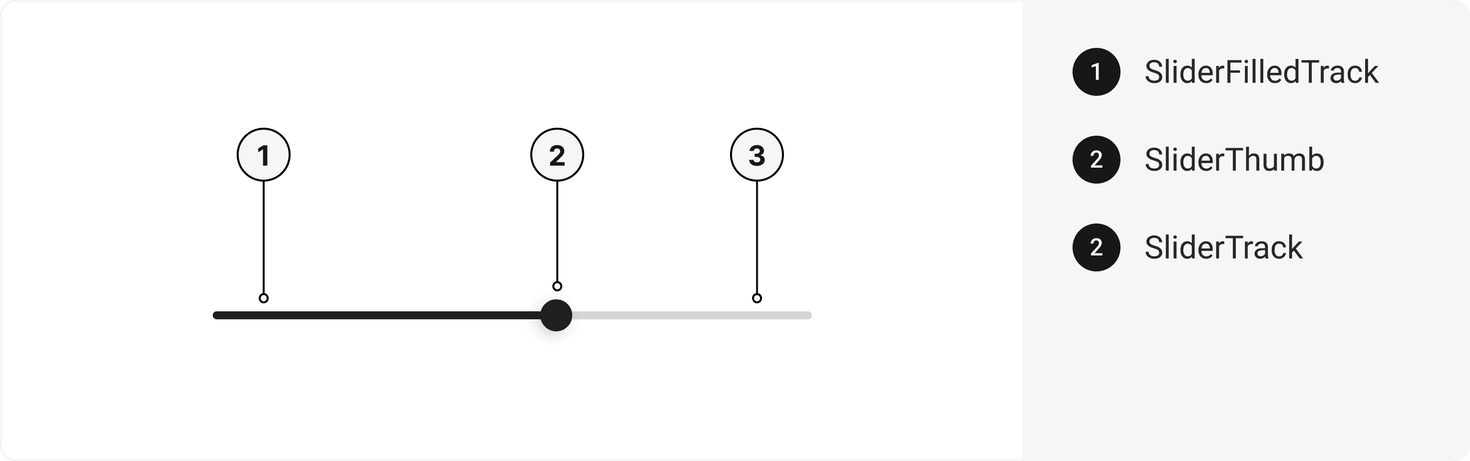
Create smooth, interactive controls with the gluestack-ui React Native Slider component. Customize track height, values, and states for a seamless slider UI experience. This is an illustration of Slider component.orientation
isDisabled
isReversed
Installation
Run the following command:
npx gluestack-ui@latest add sliderAPI Reference
To use this component in your project, include the following import statement in your file.import { Slider } from '@/components/ui/slider';
export default () => (
  <Slider>
    <SliderTrack>
      <SliderFilledTrack />
    </SliderTrack>
    <SliderThumb />
  </Slider>
);
Component Props
This section provides a comprehensive reference list for the component props, detailing descriptions, properties, types, and default behavior for easy project integration.Slider
It inherits all the properties of React Native'sView
component.
| Prop | Type | Default | Description |
|---|---|---|---|
onChange | (value: number) => void | - | Function called when the state of the Slider changes. |
isDisabled | bool | false | When true, this will disable Slider |
isReadOnly | boolean | false | To manually set read-only to the checkbox. |
sliderTrackHeight | number | 8 | To change the slider track height. |
defaultValue | number | - | To change the slider value. |
minValue | number | - | The slider's minimum value |
maxValue | number | - | The slider's maximum value. |
value | number | - | The slider's current value. |
step | number | - | The slider's step value. |
| Sx Prop | Description |
|---|---|
_thumb | Prop to style SliderThumb Component |
_track | Prop to style SliderTrack Component |
_filledTrack | Prop to style SliderFilledTrack Component |
SliderTrack
It inherits all the properties of React Native'sPressable
component.
SliderFilledTrack
It inherits all the properties of React Native'sView
component.
SliderThumb
It inherits all the properties of React Native'sView
component.
Features
- Keyboard support for actions.
- Support for hover, focus and active states.
Accessibility
We have outlined the various features that ensure the Slider component is accessible to all users, including those with disabilities. These features help ensure that your application is inclusive and meets accessibility standards.Adheres to theWAI-ARIA design pattern
.
Keyboard
- Tab: Moves focus to the next focusable element.
- Right Arrow: Increase the value of the slider by one step.
- Up Arrow: Increase the value of the slider by one step.
- Left Arrow: Decrease the value of the slider by one step.
- Down Arrow: Decrease the value of the slider by one step.
Screen Reader
- VoiceOver: When the slider is focused, the screen reader will announce the slider's value.
Props
Slider component is created using View component from react-native. It extends all the props supported byReact Native View
.
Data Attributes Table
Component receives states as props as boolean values, which are applied asdata-*
attributes. These attributes are then used to style the component via classNames, enabling state-based styling.
| State | Data Attribute | Values |
|---|---|---|
disabled | data-disabled | true | false |
focus | data-focus | true | false |
invalid | data-invalid | true | false |
Edit this page on GitHub