Menu
Build a user-friendly interface with gluestack-ui menu component in React & React Native, designed for easy navigation and accessibility. This is an illustration of Menu component.placement
Installation
Run the following command:
npx gluestack-ui@latest add menuAPI Reference
To use this component in your project, include the following import statement in your file.import {
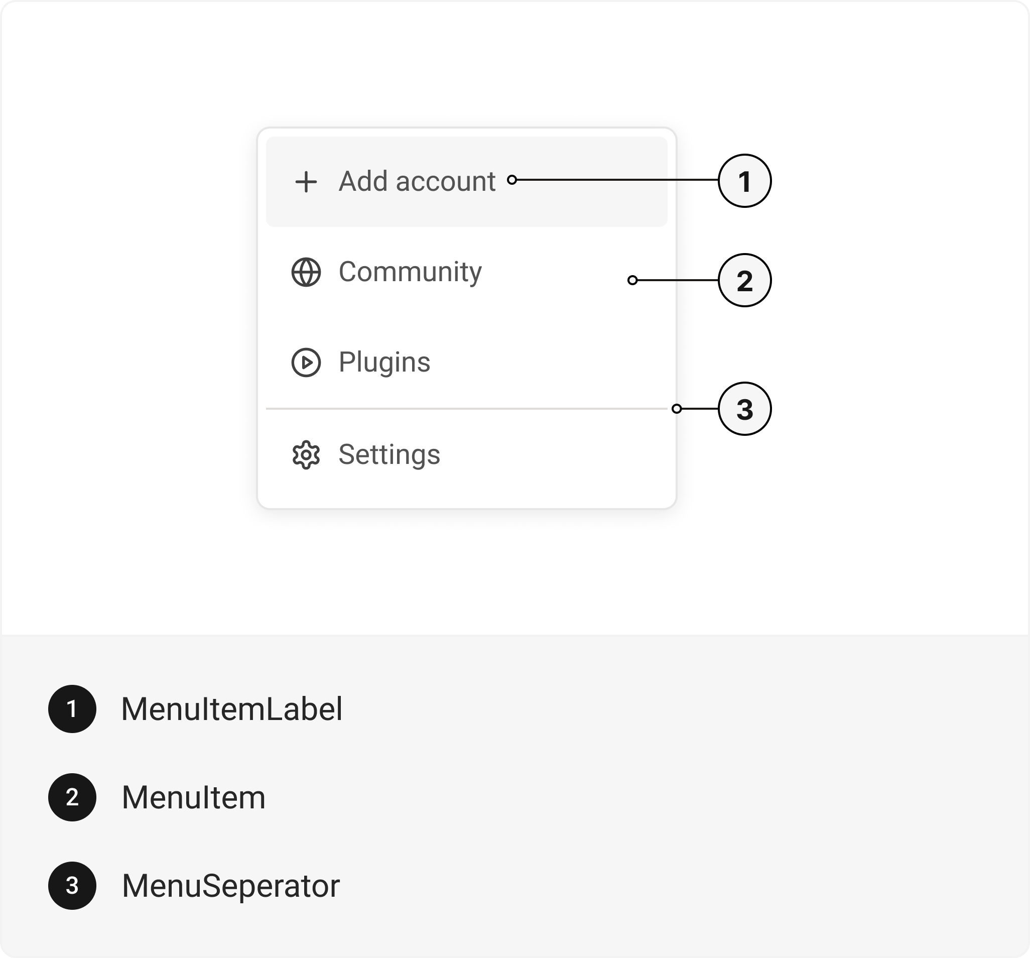
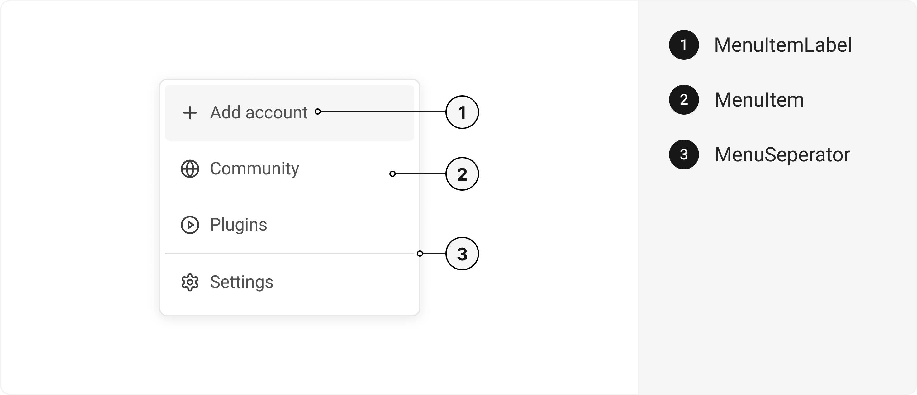
Menu,
MenuItem,
MenuItemLabel,
MenuSeparator,
} from '@/components/ui/menu';
export default () => (
  <Menu>
    <MenuItem>
      <MenuItemLabel />
    </MenuItem>
    <MenuSeparator />
  </Menu>
);
Important Note
Note: The immediate parent of MenuItem must be Menu. There should be no higher-order component (HOC) between them.
Component Props
This section provides a comprehensive reference list for the component props, detailing descriptions, properties, types, and default behavior for easy project integration.Menu
Contains all menu related layout style props and actions. It inherits all the properties of React Native'sView
component.
| Prop | Type | Default | Description |
|---|---|---|---|
trigger | (_props: any, state: { open: boolean; }) => Element | - | Function that returns a React Element. This element will be used as a Trigger for the Menu |
placement | "bottom" | "top" | "right" | "left" | "top left" | "top right" | "bottom left" | "bottom right" | "right top" | "right bottom" | "left top" | "left bottom" | bottom left | Menu placement |
defaultIsOpen | boolean | false | If true, the menu will be opened by default |
onOpen | () => void | - | This function will be invoked when the menu is opened |
onClose | () => void | - | This function will be invoked when menu is closed |
isOpen | boolean | false | Whether the menu is opened. Useful for controlling the open state |
offset | number | - | The additional offset applied along the main axis |
crossOffset | number | - | The additional offset applied along the cross axis |
disabledKeys | string[] | - | Item keys in this collection will be disabled |
closeOnSelect | boolean | true | Whether menu is closed after option is selected |
selectedKeys | 'all' | Iterable<Key> | - | The currently selected keys in the collection (controlled) |
selectionMode | 'none' | 'single' | 'multiple' | none | The type of selection that is allowed in the collection |
onSelectionChange | (keys: 'all' | Iterable<Key>) => void | - | Handler that is called when the selection changes |
MenuItemLabel
Contains all text related layout style props and actions. It inherits all the properties of React Native'sText
component.
MenuSeparator
Contains all view related layout style props and actions. It inherits all the properties of React Native'sView
component.
Features
- Keyboard support for actions
- Support for hover, focus and active states
Accessibility
We have outlined the various features that ensure the Menu component is accessible to all users, including those with disabilities. These features help ensure that your application is inclusive and meets accessibility standards. Adheres to theMENU WAI-ARIA design pattern
.
Keyboard
- Space: Opens/closes the menu
- Enter: Opens/closes the menu
- Arrow Down: Moves focus to the next focusable element
- Arrow Up: Moves focus to the previous focusable element
- Esc: Closes the menu and moves focus to menuTrigger
Screen Reader
- VoiceOver: When the menu is opened, the screen reader will say, Menu item group with 4 items. You are currently on a menu item group. To select this menu item, press Control + Option + Space. To close the menu, press Escape.
States
- aria-labelledbyidentifies the element that labels the current element.
- aria-labeldefines a string value that labels the current element.
Examples
The Examples section provides visual representations of the different variants of the component, allowing you to quickly and easily determine which one best fits your needs. Simply copy the code and integrate it into your project.Menu with Tag
Menu with Selection
Edit this page on GitHub