Home
Components
Hooks
Apps
MCP Server
Guides
Home
Overview
Getting Started
Core Concepts
Performance
Theme Configuration
Components
Typography
Data Display
Disclosure
Others
MCP Server
FormControl
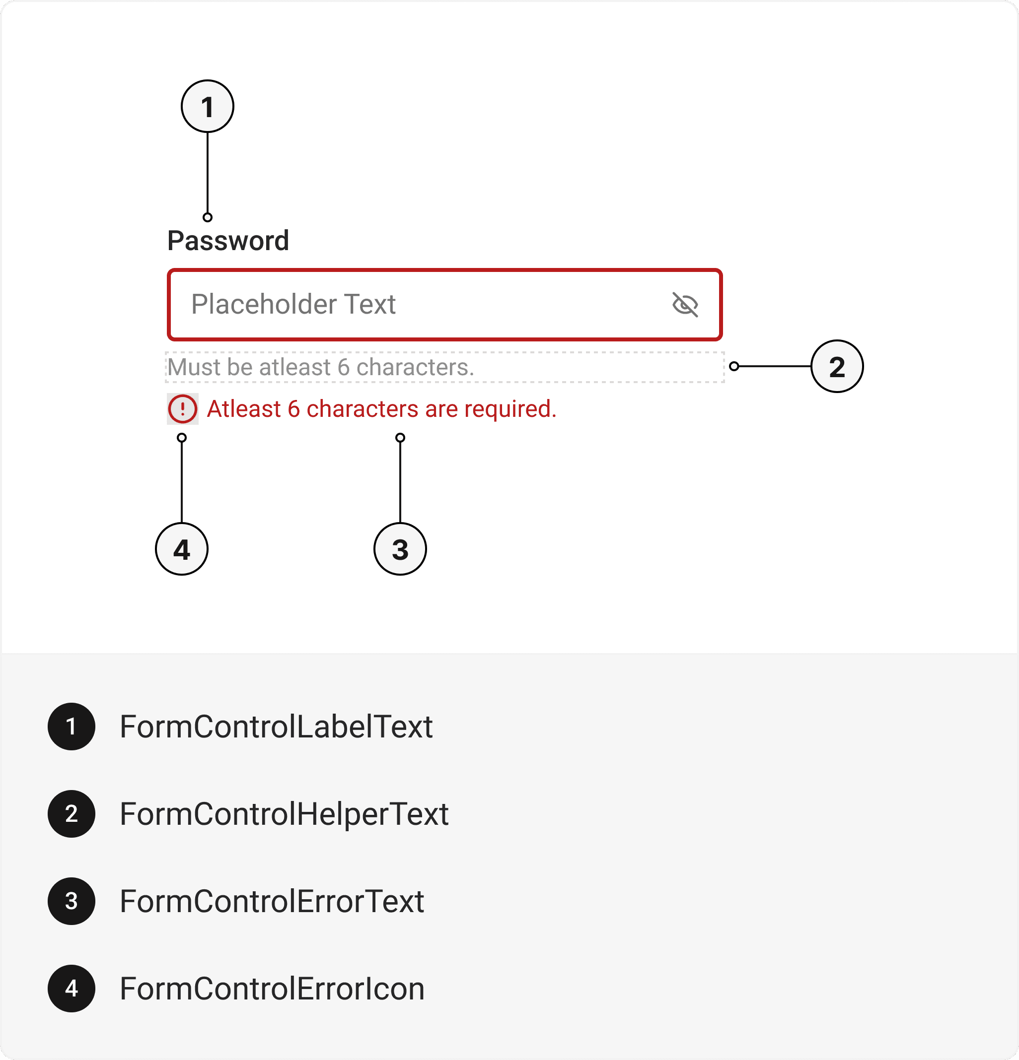
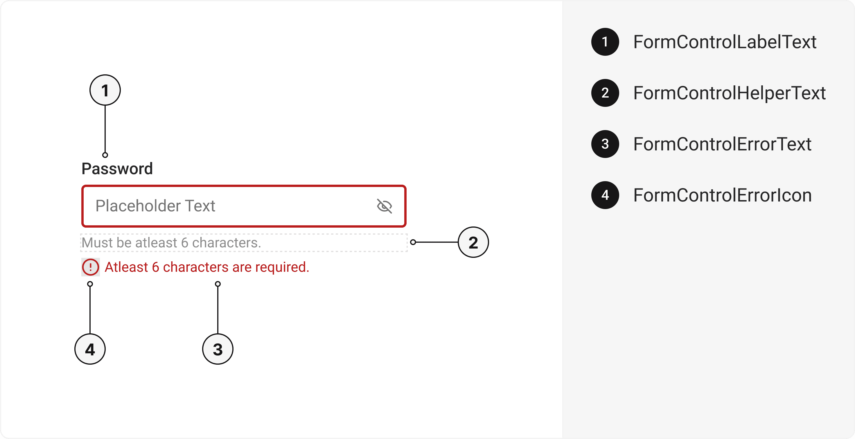
Enhance form usability with FormControl components in React. Manage validation, disabled states, and more. Easy integration for seamless form handling. This is an illustration of FormControl component.isDisabled
isReadOnly
isRequired
size
Installation
Run the following command:
npx gluestack-ui add form-controlAPI Reference
To use this component in your project, include the following import statement in your file.import { FormControl } from '@/components/ui/form-control';


export default () => (
  <FormControl>
    <FormControlLabel>
      <FormControlLabelText />
    </FormControlLabel>
    <FormControlHelper>
      <FormControlHelperText />
    </FormControlHelper>
    <FormControlError>
      <FormControlErrorIcon />
      <FormControlErrorText />
    </FormControlError>
  </FormControl>
);
Component Props
This section provides a comprehensive reference list for the component props, detailing descriptions, properties, types, and default behavior for easy project integration.FormControl
It inherits all the properties of React Native'sView
component.
| Prop | Type | Default | Description |
|---|---|---|---|
isInvalid | boolean | false | When true, invalid state. |
isRequired | boolean | false | If true, astrick gets activated. |
isDisabled | boolean | false | Disabled state true. |
isReadOnly | boolean | false | To manually set read-only state. |
FormControlLabel
It inherits all the properties of React Native'sView
component.
FormControlLabelText
It inherits all the properties of React Native'sText
component.
FormControlHelper
It inherits all the properties of React Native'sView
component.
FormControlHelperText
It inherits all the properties of React Native'sText
component.
FormControlError
It inherits all the properties of React Native'sView
component.
FormControlErrorIcon
It inherits all the properties of gluestack Style'sAsForwarder
component.
FormControlErrorText
It inherits all the properties of React Native'sText
component.
Features
- Keyboard support for actions.
- Support for hover, focus and active states.
- Option to add your styles or use the default styles.
Examples
The Examples section provides visual representations of the different variants of the component, allowing you to quickly and easily determine which one best fits your needs. Simply copy the code and integrate it into your project.Form Control with Radio
The Radio Component can be incorporated within the FormControl.Form Control with Checkbox
The Checkbox Component can be incorporated within the FormControl.Form Control with Error
Error messages can be displayed using FormControl.Form Control with Textarea
The Textarea Component can be incorporated within the FormControl.Form Control with Form Actions
Form Action Buttons can also be utilized in conjunction with FormControl.Edit this page on GitHub