Switch
Enhance your UI with a sleek Switch Component. Built on React Native, it's customizable and accessible. Perfect for toggling options seamlessly.Important Note
The current component is functioning as expected, but we have decided to rebuild it entirely to align with our vision and enhance its performance. It is primarily based on React Native, and while we have made minimal modifications so far, our upcoming rebuild will involve significant changes to ensure it closely matches our desired structure and meets our objectives.
size
isDisabled
Installation
Run the following command:
npx gluestack-ui add switchAPI Reference
To use this component in your project, include the following import statement in your file.import { Switch } from '@/components/ui/switch';

export default () => <Switch />;
Component Props
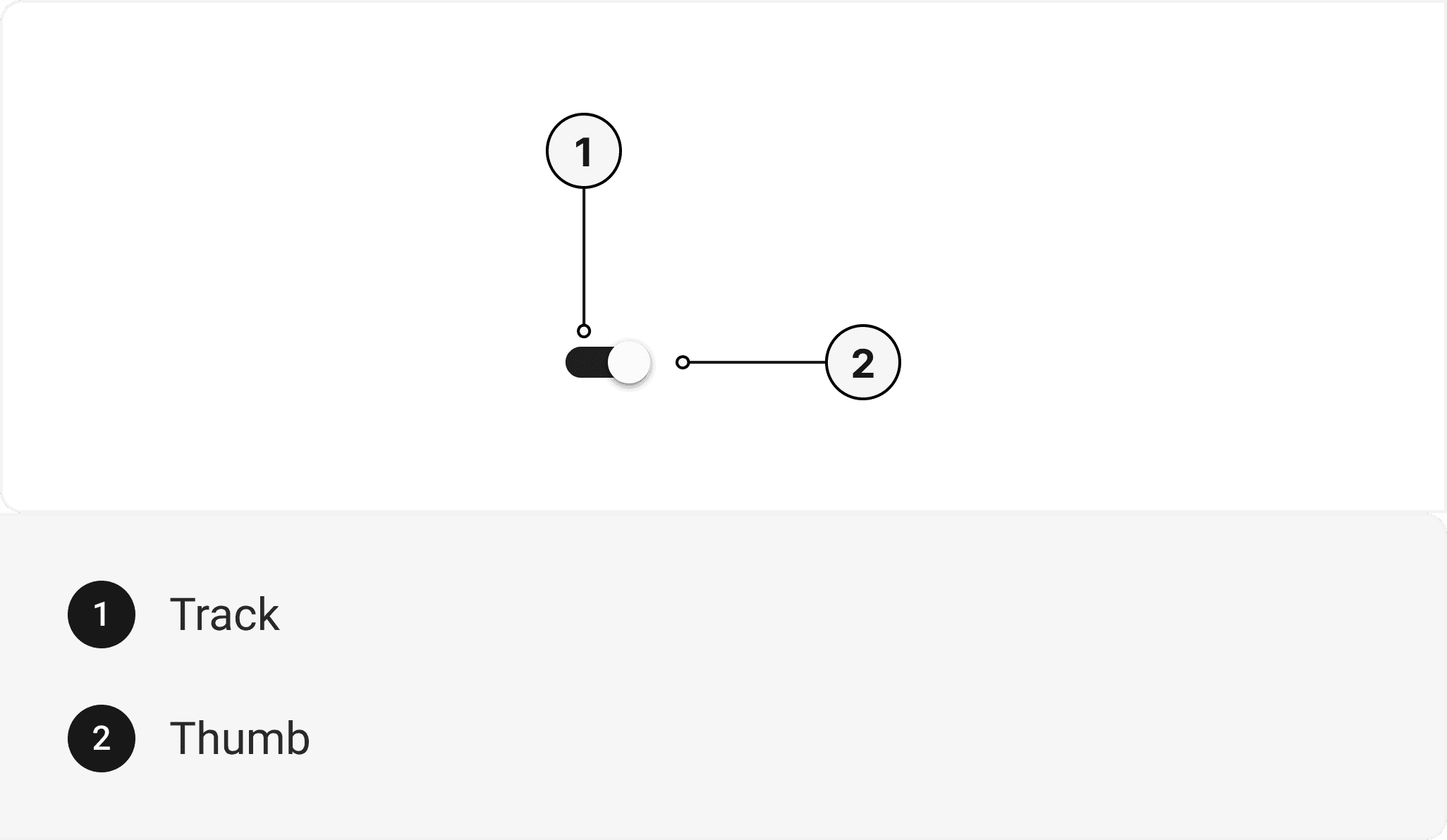
This section provides a comprehensive reference list for the component props, detailing descriptions, properties, types, and default behavior for easy project integration.Switch
Contains all switch related layout style props and actions. It inherits all the properties of React Native'sSwitch
component.
| Prop | Type | Default | Description |
|---|---|---|---|
isDisabled | boolean | false | When true, the switch is disabled and cannot be toggled |
isInvalid | boolean | false | When true, the switch displays an error state. |
isRequired | boolean | false | When true, sets aria-required="true" on the switch. |
isHovered | boolean | false | When true, the switch displays a hover state. |
value | boolean | false | The value of the switch. If true the switch will be turned on. |
defaultValue | boolean | false | The defaultValue of the switch. If true the switch will be turned on initially. |
onToggle | () => any | - | Callback to be invoked when switch value is changed. |
Accessibility
We have outlined the various features that ensure the Button component is accessible to all users, including those with disabilities. These features help ensure that your application is inclusive and meets accessibility standards.Adheres to theWAI-ARIA design pattern
.
Keyboard
- Tab: Moves focus to the next focusable element.
- Space: Triggers the switch's action.
Screen Reader
- VoiceOver: When the switch is focused, the screen reader will announce the switch's action and its current state.
Props
Switch component is created using Switch component from react-native. It extends all the props supported byReact Native Switch
.
Switch
| Name | Value | Default |
|---|---|---|
size | sm | md | lg | md |
Important Note
Note: These props are exclusively applicable when utilizing the default configuration of gluestack-ui/config. If you are using a custom theme, these props may not be available.
Examples
The Examples section provides visual representations of the different variants of the component, allowing you to quickly and easily determine which one best fits your needs. Simply copy the code and integrate it into your project.Switch With Label
An example of a switch component with a label, which includes another switch component for toggling additional options.Checked State
An example of a switch component used within a checked state component to represent a pre-selected or activated option.Edit this page on GitHub